Distressing Effects On Screen Print Transfers
Browse Video Categories
Transfer Application | Artwork & Apparel | Easy View Tutorials | Webinars | Ordering Tips | Business | Heat Presses
The Easy Way to Distress Your Art
Hey friends, Dave here with Transfer Express and today, we’re talking all about distressed t-shirt graphics!
This timeless design trick can help give your graphics that vintage vibe or help improve the feel of large, solid areas of ink coverage so your prints are a little more comfortable to wear.
We’ll take a look at the five different distressed textures you can add to your artwork with just a couple clicks, as well as some tips and tricks for adding some custom texture to your designs.
Ready? Let’s get to it!
Regardless of if you’re designing with the huge catalog of customizable artwork in our free, Easy View online designer, or, if you’re uploading your own custom artwork, you can use the same method here to add some distressing to your designs. So, let’s hop over to TransferExpress.com to get started.
Here at TransferExpress.com, we can click on ‘Order Transfers’ or this online designer button here at the top of the page to jump into Easy View.
The Easy view online designer is an incredibly powerful tool for apparel decorators because it gives you the ability to create professional designs quickly and efficiently, regardless of your skill level or experience with Photoshop or Illustrator.
Just like we’re doing here we can browse layouts, select one we like, then customize it! Not only can we adjust text and change fonts if we want, but we can also modify the designs with just a few clicks.
Here we’ll bring a panther mascot in right to the center of the design to replace this number.
Next up, let’s add some distressing effects. All we have to do is click here on the left side in the edit menu and click “add” here next to distress. That opens up our selection. We’ve got 5 different types to choose from - some subtle, and some a little more noticeable. You can easily change the effect by repeating the same process and selecting a new texture to find the one you like best, or clicking "clear" distress at the bottom of the menu to remove all distressing.
The Rain effect is a nice vertical line distress that’s not too destructive. Fine text might be in the danger zone of being legible but it’s not too disruptive. Here on our full size graphic, everything looks great.
Splatter, on the other hand, has some large spots of distressing that are going to knock out more ink. This great, stylized-looking texture should be used primarily for graphics with no small details or fine text. It’ll work best with those big, bold fonts, and solid ink areas to not disrupt your art too much. Although here with our text with thin lines we can still read everything even with some spots removed.
Next up is Grunge. A little bit heavier than the Rain, Grunge is a more pronounced distressed effect for that real-world, worn-in vintage look. Again, pretty ideal for bolder graphics with large areas of ink coverage, but can dramatically change the way that any ink feels on the garment, giving it much more room to breathe and move.
Leather effect brings another style of linear distressing to your artwork, this time with a little bit finer lines than Grunge or Rain. This one gives your prints that almost natural cracked look across the entire graphic for a nice uniform texture.
Lastly, we have Crackled. This effect is probably the closest you can get to a natural-looking worn plastisol t-shirt print that’s been around the block a few times, with areas of ink missing that mimic t-shirt folds and regular wear. Not only are there larger areas in that natural pattern, but there’s also small elements of ink being knocked out which give it that great, natural look.
Now, we mentioned fine details or small text with some of these styles, but one nice tip to keep in mind here is that you can remove the distressing effect just on specific elements! It’s real easy as long as you have Easy Prints artwork from the designer or your own uploaded vector artwork. Just click the element you want to remove the distressing from and click clear, over here in the effects section of the edit menu where we selected our texture in the first place. With one simple click, it’s easy to remove- and even reapply if needed by clicking “apply to selected”.
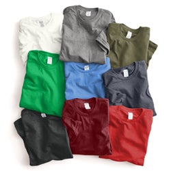
Now these textures do vary slightly from screen to finished print. Here you can see examples of all of the effects on screen versus the finished t-shirts to get a good idea of how there may be some subtle differences. If you’re worried about an area of your design getting a big chunk of ink knocked out or removed by the distress, just note your order to say “be sure distressing does not remove text” or whatever you want- our artists will make it happen for you.
Of course, if you want to get creative and don't want to roll with any of these standard options, you can manually add distressing with clipart that’s available here in the designer! Just search “distress” or “splatter” in the clip art library, import a texture you like and select the ink color as “show through, or "no ink”. That will remove the ink on your print exactly how it’s placed and appears on screen. No minor variances here.
One graphic design tip when doing this is to rotate the texture overlay any time you duplicate it. That way it looks much more natural and your eye isnt drawn to repeating sections here and there.
It’s worth a mention here, too, that it’s best to add distressing when you’re finished with your design, if you add effects then continuing to add more elements around here on the gang sheet, you may run into a little bit of lag with the system as it’s reconfiguring the distressing overlay every time you’re modifying elements.
These effects for this video were printed with our Goof Proof screen printed transfers, which are a plastisol ink transfer that looks and feels just like a traditional screen print on the garment. I love them because they give you screen printed quality without the hassle of inks, emulsion, squeegees, setup or messy cleanup that comes with traditional direct screen printing.
Of course, you can use this effect on other transfers as well, like our UltraColor Pro or Stretch transfers.
For our direct to film UltraColor Max transfers, distressing is a no-go. Because it creates some fine areas that may be too small to receive adhesive, we do not recommend it for the direct to film process.
Get your own FREE distressed sample pack to try out all of these textures yourself on your heat press.
So get your sample pack and start creating artwork in the designer right now. Easy View is completely free to use, all you need is a Transfer Express account. Seriously, just go signup and poke around in there, you’ll be blown away by all of the capabilities!
Be sure to subscribe to the Transfer Express YouTube page to stay up to date on all of the helpful t-shirt printing tips, tricks, inspiration and education that we’re dropping every single week. Until next time, I’m Dave, happy pressing!

